
BLOG
Why Workout Mirrors Are Becoming a Natural Part of Modern Homes

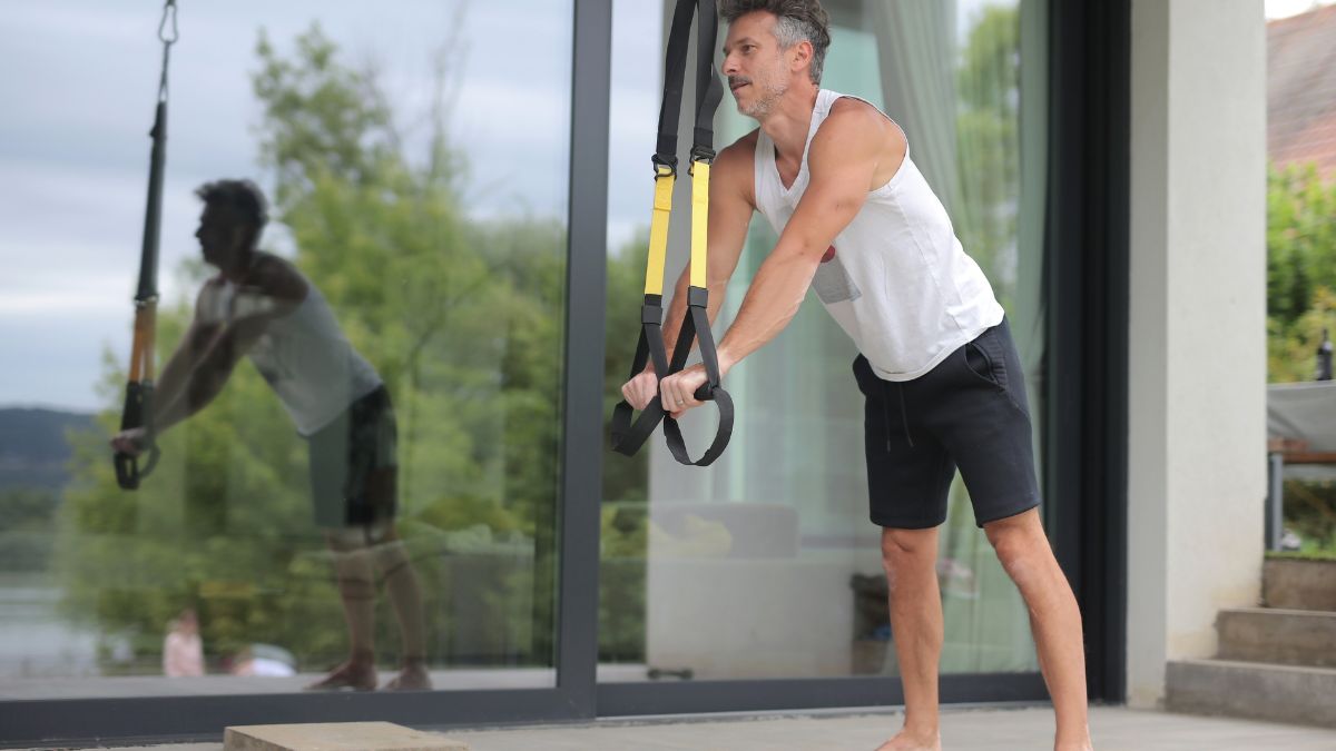
Not long ago, the idea of a full workout happening in front of a mirror at home felt a little… futuristic. Something you’d expect in a sci-fi movie or a luxury penthouse, not a regular living room or spare bedroom. Fast forward to today, and workout mirrors are quietly becoming as normal as coffee machines and robot vacuums.
This shift didn’t happen overnight. It’s the result of how our homes, habits, and expectations around fitness have changed. And once you’ve lived with one, it’s surprisingly hard to imagine going back, notes Exceptional Property Management team.
Homes Are Doing More Than Ever
Modern homes aren’t just places to sleep anymore. They’re offices, classrooms, social spaces, and yes—gyms. When remote work became common, people started rethinking how every square foot was used. That unused corner. The wall opposite the couch. The spare room was mostly filled with laundry.
A workout mirror fits neatly into this new reality. When it’s off, it looks like a sleek mirror. When it’s on, it becomes a personal training space. No bulky racks. No stacks of plates. No visual clutter. It respects the fact that most people don’t want their home to look like a gym, even if they want to train like they’re in one.
That blend of function and design is a big reason workout mirrors feel so natural in modern homes.
The Convenience Factor Is Real
Let’s be honest. Most people don’t skip workouts because they hate exercise. They skip because of friction. The drive to the gym. Waiting for equipment. Changing schedules around peak hours. By the time you factor all that in, a “quick” workout can eat up two hours.
With a workout mirror, friction disappears. You roll out of bed. Tap the screen. You’re training. No commute. No awkward glances. No pressure to “make it worth the trip.”
This convenience matters more than people admit. When fitness becomes something you can do anytime, consistency improves. And consistency is where real results come from—not perfect programs or trendy routines.
Visual Feedback Changes Everything
There’s something powerful about seeing yourself move. Not in a judgmental way, but in a practical, corrective one. Workout mirrors provide real-time visual feedback, which is something most people never get when exercising alone.
You notice posture issues. You catch small form mistakes. You become more aware of how your body actually moves, not how you think it moves.
Over time, this builds confidence. Movements feel cleaner. Strength training feels safer. And you start trusting your body more because you understand it better.
For many users, this is the moment when home workouts stop feeling “less than” gym workouts.
Coaching Without the Intimidation
Personal trainers are amazing—but not everyone feels comfortable working with one in person. There’s pressure. There’s vulnerability. And sometimes there’s just the cost.
Workout mirrors quietly solve this problem. They offer guided workouts, cues, and structure without the social anxiety. You can pause, rewind, repeat, or switch classes without explaining yourself to anyone.
Some days you push hard. Other days you take it slow. No judgment either way.
That sense of control makes fitness feel more approachable, especially for beginners or people returning after a long break.
Space-Saving Fitness Makes Sense Now
Big equipment made sense when garages were empty and basements were huge. That’s not the reality for most people today. Urban living, smaller homes, and shared spaces demand smarter solutions.
Workout mirrors take advantage of vertical space, which is often underused. Instead of spreading equipment across the floor, everything stays compact and organized. It’s strength training without sacrificing your living space.
For families, this is huge. One piece of equipment can serve multiple users with different goals, schedules, and experience levels.
Fitness That Adapts to Your Life
Traditional fitness routines often demand rigid schedules. Classes start at fixed times. Gyms open and close. Life, meanwhile, is unpredictable.
Workout mirrors flip that dynamic. The workout adapts to you, not the other way around.
Busy morning? Do a 20-minute session. Feeling energized at night? Go longer. Traveling? Pick up where you left off when you’re back.
This flexibility makes fitness sustainable. And sustainability is what turns short-term motivation into long-term habit.
A Subtle Shift in Motivation
Something interesting happens when fitness lives in your home. It stops being a “special event” and starts becoming part of your routine.
You walk past the mirror. You remember yesterday’s session. You think, I could do ten minutes right now. That low barrier is powerful.
Workout mirrors don’t rely on hype or guilt. They quietly encourage movement through presence. And that kind of motivation lasts longer than any New Year’s resolution.
Technology That Feels Human
Early fitness tech often felt cold or overly technical. Modern workout mirrors are different. They’re intuitive. Visual. Designed around how people actually move and learn.
The best ones feel less like machines and more like helpful guides. They fade into the background when you’re focused, and step in when you need support.
That balance—between tech and humanity—is what makes them feel at home in modern living spaces.
More Than a Trend
It’s easy to label workout mirrors as a trend. But trends fade. What we’re seeing instead is a shift in how people relate to fitness.
People want results, yes. But they also want comfort, privacy, efficiency, and design that fits their lives. Workout mirrors check all those boxes.
They’re not replacing gyms. They’re redefining what a “gym” can be.
The New Normal of Home Fitness
As homes continue to evolve, fitness will keep moving inward—literally. Workout mirrors represent a future where staying active doesn’t require disruption, travel, or sacrifice.
They blend seamlessly into daily life. They respect your space. They meet you where you are, physically and mentally.
And that’s why workout mirrors aren’t just a cool piece of fitness tech anymore. They’re becoming a natural, almost expected, part of the modern home.


Trading a traditional office cubicle or suburban home desk for an ever-changing view out of an RV window is one of the most liberating remote work choices you can make. However, turning a recreational vehicle into a high-performing mobile office requires far more than packing a laptop and heading into the wilderness.
Successful remote work on the road relies on strategic planning around internet connectivity, off-grid power, physical ergonomics, safety, and daily routines. Understanding these core operational requirements before launching your mobile lifestyle ensures you maintain professional reliability while enjoying freedom on the open road.
1. Reliable Internet Requires Multi-Provider Redundancy
Quick Answer: Never rely on a single connectivity source while working on the road; build a multi-provider setup utilizing satellite internet alongside dual-carrier cellular hotspots.
Relying solely on campground Wi-Fi is one of the quickest ways to disrupt your workweek. Public RV park networks are notoriously slow, unencrypted, and easily overloaded when dozens of campers attempt to stream video at night.
To build a reliable rv remote work internet redundancy system, combine high-speed satellite internet with cellular data plans from at least two major networks (such as Verizon and AT&T). Utilizing a dual-SIM mobile router with an exterior roof-mounted antenna allows you to automatically failover to whichever network offers the strongest signal in remote areas.
2. Power Management Beyond Campground Hookups
Quick Answer: Calculate your total daily watt-hour consumption and invest in a lithium (LiFePO4) battery bank, pure sine wave inverter, and roof solar panels to keep work devices powered without shore power.
If you plan to boondock on public lands away from RV park electrical pedestals, managing your electrical grid becomes a daily priority. Laptops, external monitors, cellular routers, and satellite dishes draw a continuous stream of power throughout an eight-hour workday.
Thorough off-grid rv power system planning ensures your computer stays running even during overcast days. Pure sine wave inverters are essential because they supply clean, stable electricity that protects sensitive laptop transformers and monitor power supplies from voltage spikes.
3. Off-Grid Safety and Emergency Communication
Quick Answer: When traveling outside cellular coverage zones, carry dedicated satellite communication gear to maintain emergency contact and personal safety.
Working remotely often leads digital nomads into breathtaking, isolated locations like national forests and desert BLM land. While camping off the beaten path offers unmatched tranquility, it also means help can be hours away if you experience a vehicle breakdown, medical issue, or sudden severe weather event.
While satellite internet keeps your laptop connected at camp, stepping away for weekend trail exploration or driving through isolated mountain passes leaves you vulnerable. Carrying a reliable satellite handheld radio ensures you can broadcast two-way emergency communications and summon aid even when cell towers are hundreds of miles away.
4. Designing an Ergonomic Mobile Workspace
Quick Answer: Replace soft RV dinette cushions with supportive seating, use laptop stands, and adjust your workspace alignment to prevent neck and lower back strain.
Standard RV interiors are designed for weekend dining and lounging, not eight hours of focused laptop computer work. Hunching over a low dinette table or typing from a soft sofa quickly leads to chronic neck pain, wrist strain, and spinal fatigue.
Achieving a healthy mobile workspace ergonomic setup requires intentional modifications:
- Upgrade Seating: Replace unsupportive booth cushions with an ergonomic office chair secured during travel.
- Elevate Screens: Use an adjustable laptop stand paired with an external keyboard and mouse so your eyes rest at the top third of the monitor.
- Convert Space: Modify a rear bunkhouse, toy hauler garage, or removed dinette area into a dedicated, stationary desk nook.
5. Navigating Work-Life Balance and Travel Schedules
Quick Answer: Schedule travel days exclusively on weekends or non-work days, and establish strict boundaries between professional office hours and sightseeing.
One of the biggest pitfalls for new mobile workers is trying to travel too fast. Driving two hundred miles, setting up camp, troubleshooting internet signals, and jumping straight onto a Zoom meeting creates extreme burnout.
Adopt a slower travel pace, staying two to four weeks at each location. Plan all driving shifts for non-working days so unexpected highway delays or flat tires never cause you to miss a critical client presentation. Additionally, account for shifting time zones as you cross state lines to keep calendar invites accurate.
6. Managing Mail, Domicile, and Legal Logistics
Quick Answer: Select an official state of domicile (such as South Dakota, Florida, or Texas) and hire a professional mail-forwarding service to manage tax filings and physical mail.
Full-time RV living requires solving administrative challenges before leaving your permanent home. You need a physical address to maintain vehicle insurance, register voter records, hold a driver’s license, and file state income taxes.
Specialized mail-forwarding services scan physical mail envelopes, upload PDF previews online, and forward physical packages directly to local post offices (via General Delivery) along your travel route. Establishing your legal domicile early prevents compliance headaches down the road.
Myth vs. Fact: Working Full-Time From an RV
- Myth: You can travel to a new national park every single night while working full-time.
- Fact: Moving constantly creates operational exhaustion. Successful nomads travel slowly, balancing workweeks with weekend exploration.
- Myth: Any cell phone hotspot will provide enough bandwidth for video conference calls anywhere.
- Fact: Topography, tree canopy cover, and network congestion dramatically alter cellular speeds; directional antennas and signal boosters are frequently required.
Frequently Asked Questions
Can I run a laptop and secondary monitor on an RV battery overnight?
Yes. A modern 100Ah lithium battery holds roughly 1,200 watt-hours of power, which easily powers a laptop and LED monitor (drawing ~60-80 watts combined) for an entire workday with ample capacity remaining for lights and water pumps.
How do full-time RV workers receive packages on the road?
Most nomads use Amazon Lockers, FedEx Ship Center holding services, or postal General Delivery, which allows you to send packages directly to a local post office in the town you are visiting.
Working from an RV is a rewarding way to blend professional productivity with outdoor adventure. By establishing internet redundancy, engineering a robust off-grid power system, prioritizing ergonomic health, and keeping reliable satellite communications on hand, you eliminate common road friction. Thoughtful preparation allows you to log into work with total confidence, no matter where you park your home.

An electronic data destruction request is not simply a request to remove old equipment. It is a security and asset-disposition project that requires a clear plan for devices that may still contain confidential business information, customer records, credentials, financial information, or employee data.
Back Thru The Future helps organizations turn an electronic data destruction request into a managed process. That process can include identifying data-bearing assets, maintaining control over equipment, choosing a suitable sanitization or destruction method, and creating records documenting what happened to each item.
Deleting files, reformatting a drive, or completing a factory reset may not meet every organization’s security, contractual, or policy requirements. The appropriate approach depends on the type of media, the sensitivity of the information, the condition of the device, and whether the equipment is intended for reuse or physical destruction.
Retired technology can include far more than desktop computers. A complete request may involve laptops, servers, hard drives, solid-state drives, backup tapes, smartphones, tablets, scanners, network equipment, medical devices, and other electronics with embedded storage.
When an office closure, equipment refresh, or data-center project is already underway, organizations benefit from defining custody, inventory, and destruction requirements before devices begin moving between departments, sites, or service providers.
Why Electronic Data Destruction Matters
Data-bearing devices may continue to hold information long after their day-to-day use has ended. A retired hard drive can contain files, archived email, application data, passwords, or backups. Mobile devices and embedded-storage equipment can retain account information, device identifiers, configuration data, communications, and authentication details.
The goal is to make recovery of targeted data infeasible for the required level of effort. NIST media sanitization guidance describes a program-focused approach that helps organizations align disposal and reuse decisions with the sensitivity of the information involved. It also reinforces an important principle: an organization should select techniques and controls appropriate to its own risk, media, and disposition needs.
What To Do When You Receive A Data Destruction Request
- Identify the assets. Build a list of the devices and media included in the project. Include serial numbers or other available identifiers when accountability is important.
- Classify the information. Determine whether the assets may contain ordinary business data, confidential information, regulated records, or highly sensitive material.
- Secure the equipment. Establish where assets will be held, who can access them, and how they will be prepared for pickup, transport, or onsite processing.
- Select the destruction method. Match the method to the media type, device condition, reuse goals, and security requirements.
- Document completion. Retain asset records, service documentation, and certificates of destruction as appropriate for the project.
- Manage remaining materials responsibly. Route eligible non-data-bearing components and equipment through suitable reuse or electronics recycling channels.
Back Thru The Future can support these stages as part of a single coordinated service, rather than treating destruction as an isolated final step. This is especially useful when a project involves mixed media, multiple departments, large volumes of equipment, or several locations.
Choosing The Right Data Destruction Method
There is no single method that fits every device. Back Thru The Future can help evaluate the media and the desired outcome before recommending a path forward.
- Secure data wiping: May be appropriate for functioning devices that an organization intends to reuse or resell, provided the selected sanitization process fits the device and internal requirements.
- Degaussing: Can be considered for certain magnetic media, including some hard drives and tapes. It is not a solution for solid-state storage.
- Physical destruction: Hard drive shredding or other physical destruction methods may be appropriate for damaged, obsolete, highly sensitive, or non-reusable media.
- Mobile-device destruction: Phones, tablets, and other small devices may contain embedded flash storage that is not designed to be removed like a traditional hard drive.
Hard Drives And Solid-State Drives
Hard drives and solid-state drives store data differently, so they should not be handled the same way in disposal. Back Thru The Future can help determine whether documented wiping, physical destruction, or another approved approach is more appropriate. Asset tracking and defined chain-of-custody practices help maintain visibility from collection through final processing.
Backup Tapes
Backup tapes are often retained for years and can be overlooked during office moves, system migrations, or storage cleanouts. When tapes no longer serve a legal, operational, or retention purpose, shredding can provide a direct means of physical destruction. Tapes should not be placed into ordinary trash or recycling streams without considering the information they contain.
Phones, Tablets, And Embedded Devices
Employee upgrades, trade-ins, facility closures, and mobile device refreshes can leave organizations with large quantities of small, data-bearing electronics. Back Thru The Future offers secure destruction options for cell phones, tablets, and other embedded-storage devices, with attention to the separate handling needs created by batteries and electronic components.
Compliance Documentation And Operational Risk
A verbal assurance that equipment was destroyed is rarely enough for a well-managed program. Organizations may need asset inventories, barcode-based tracking, inventory validation, service records, and certificates of destruction to show that the requested work was completed. These records can help security teams, compliance personnel, auditors, and leadership understand the final disposition of retired assets.
Back Thru The Future provides onsite and facility-based options for hard drives, tapes, and other data media. On-site service may be useful when equipment cannot be removed from a facility before destruction, when leadership needs visibility into the process, or when a data center, healthcare site, financial office, legal practice, or retail location has a high-sensitivity project.
Combining Data Security With Electronics Recycling
Secure data destruction and responsible electronics recycling can work together, but data protection must come first. Data-bearing components should be identified and sanitized or destroyed before equipment moves into reuse, resale, recovery, or recycling channels. This separation helps organizations pursue sustainability objectives without compromising information security.
Questions To Ask Before Submitting A Request
- Which devices and media may contain sensitive information?
- Is the equipment intended for reuse, recycling, or physical destruction?
- Does the project require on-site service or secure transport?
- How will assets be inventoried, tracked, and verified?
- What documentation will be provided after completion?
- Are there retention, contractual, regulatory, or internal policy requirements?
- Is this a one-time project, a facility closure, or a recurring collection program?
Conclusion
An electronic data destruction request deserves a documented process, not a quick delete command or an ordinary recycling pickup. Back Thru The Future offers organizations a structured way to protect sensitive information, manage retired technology, verify asset disposition, and retire equipment with greater confidence.

Healthy-looking skin is influenced by more than the products on a bathroom shelf. A gentle routine, regular rest, stress management, sun protection, and everyday hygiene can all support skin comfort and appearance. For some people, restorative practices such as massage therapy can also provide a dedicated opportunity to slow down and relax.
That does not mean every breakout, dry patch, rash, or change in hair can be solved through lifestyle habits. Skin concerns can have many causes, including genetics, medical conditions, medications, allergies, and environmental exposures. The goal is not perfection. It is creating realistic habits that help support the skin barrier while recognizing when professional care is needed.
The Skin, Mind, And Body Connection
The skin is a protective barrier that responds to both external and internal influences. Weather, cleansing habits, friction, sunlight, and cosmetic products matter, but so can sleep disruption, emotional stress, and illness. When the body is under strain, some people notice increased sensitivity, dryness, itching, blemishes, or a generally tired appearance.
The relationship is also two-way. A visible flare-up can affect confidence and increase stress, while a stressful period may make it harder to maintain helpful routines. This does not mean stress is the sole cause of a skin condition. It simply means that supporting overall well-being can be a useful part of a broader skin care plan.
How Sleep Supports Skin Health
What Happens During Rest
Sleep is important for physical recovery, mood, and daily functioning. Poor or inconsistent sleep can leave people feeling worn down, which may also show in the skin through dullness, puffiness, or increased sensitivity. Adults generally need different amounts of sleep depending on age, but consistent sleep habits and a restful bedroom environment can help support better-quality rest.
Better sleep is not a cure for acne, wrinkles, eczema, or other skin conditions. Still, protecting sleep can make it easier to follow a simple routine, manage stress, and give the body time to recover regularly.
Simple Sleep Habits To Try
- Keep sleep and wake times fairly consistent, including on weekends when possible.
- Dim bright lights as bedtime approaches.
- Move phones and tablets away from the pillow.
- Keep the bedroom cool, quiet, and comfortable.
- Create a brief wind-down routine with reading, gentle stretching, or slow breathing.
What Stress Can Do To The Skin
Ongoing stress can affect the body in many ways, including sleep, concentration, appetite, and energy. It may also coincide with changes in oiliness, irritation, inflammation, or the urge to pick at blemishes. For example, someone working late for several nights may skip cleansing, sleep poorly, and notice that their skin feels more reactive than usual.
A stressful week does not automatically create a lasting skin problem. Instead of trying to eliminate every source of stress, focus on short practices that are easy to repeat:
- Take a brief walk, especially outdoors.
- Breathe slowly for two minutes between tasks.
- Release tension in the jaw, neck, and shoulders with gentle stretches.
- Set a stopping point for late-night work or scrolling.
- Talk with a qualified mental health professional if stress feels difficult to manage on your own.
Build A Simple Daily Skin Care Routine
Morning Steps
- Cleanse gently, or rinse with lukewarm water if cleansing in the morning feels drying.
- Apply a moisturizer that feels comfortable for your skin.
- Use broad-spectrum sunscreen when spending time in daylight.
- Keep the routine short enough to use even on rushed mornings.
Evening Steps
- Remove makeup and sunscreen before bed.
- Cleanse without scrubbing or using very hot water.
- Use one targeted product only if your skin tolerates it.
- Finish with a moisturizer to help reduce dryness or tightness.
Skin type and skin needs can change with the season, age, treatments, and environment. Dry skin may prefer a richer fragrance-free moisturizer, while oily or blemish-prone skin may prefer lighter non-comedogenic products. Sensitive skin often benefits from fewer products and slower changes. Dermatologists generally recommend washing the face with a gentle, non-abrasive cleanser and lukewarm water rather than scrubbing it.
Wellness Habits That Support The Skin
Wellness does not need to be a strict lifestyle project. Small, repeatable choices are often more sustainable than an elaborate routine that creates extra pressure.
- Movement: Regular activity can support mood and help manage stress.
- Balanced meals: Include a variety of vegetables, fruit, protein, whole grains, and healthy fats when possible.
- Hydration: Drink regularly throughout the day without relying on extreme water-intake rules.
- Sun protection: Use sunscreen, seek shade, and wear protective clothing or sunglasses when appropriate.
- Clean habits: Wash pillowcases, clean makeup tools, and avoid picking at the skin.
- Recovery: Schedule breaks before exhaustion becomes the norm.
Common Routine Mistakes To Avoid
- Introducing several active products at the same time.
- Scrubbing away oil or flakes with harsh tools or cleansers.
- Switching products every few days before giving a routine time to settle.
- Skipping sunscreen because the skies are cloudy.
- Copying a routine designed for someone with very different skin needs.
- Expecting lifestyle changes to replace medical diagnosis or treatment.
- Following social media advice without considering the source or potential risks.
When To Seek Professional Advice
Consider speaking with a dermatologist or other qualified healthcare professional about persistent acne, redness, itching, scaling, pain, sudden hair shedding, or changes that do not improve with gentle care. Prompt advice is especially important when a concern spreads, bleeds, scars, disrupts sleep, or interferes with daily life.
During an appointment, mention recent product changes, allergies, medications, sleep difficulties, major stressors, and symptoms that seem to trigger or worsen the issue. Those details can help a clinician understand the full picture and recommend appropriate next steps.
A Simple Plan For Healthier-Looking Skin
Skin care works best when it fits into real life. Start with three practical actions:
- Keep your morning and evening routine gentle and simple.
- Protect sleep with a consistent wind-down period.
- Choose one stress-relief practice that feels easy to repeat.
Healthier-looking skin does not require a perfect schedule or a crowded shelf of products. Consistent, gentle care, paired with rest and reasonable expectations, can be a more helpful long-term approach.
-

 BLOG1 year ago
hanime1: The Ultimate Destination for Anime Lovers
-

 Technology1 year ago
GLAADVoice.com: How You Can Get Involved and Make a Difference
-

 BILLS1 year ago
Why Does My Instagram Reel Stop Getting Views After One Hour? How to Fix It?
-

 ENTERTAINMENT1 year ago
Sflix: How It’s Changing the Way We Watch Movies and TV Shows
-

 BLOG1 year ago
Imginn: The Ultimate Tool to View Instagram Content Anonymously
-

 BLOG1 year ago
NHentai.nef: Understanding the Popular Hentai Archive
-

 ENTERTAINMENT1 year ago
Crackstreams 2.0: The Future of Free Sports Streaming?
-

 BLOG1 year ago
ThisVid: What Makes It Stand Out in the World of Online Videos